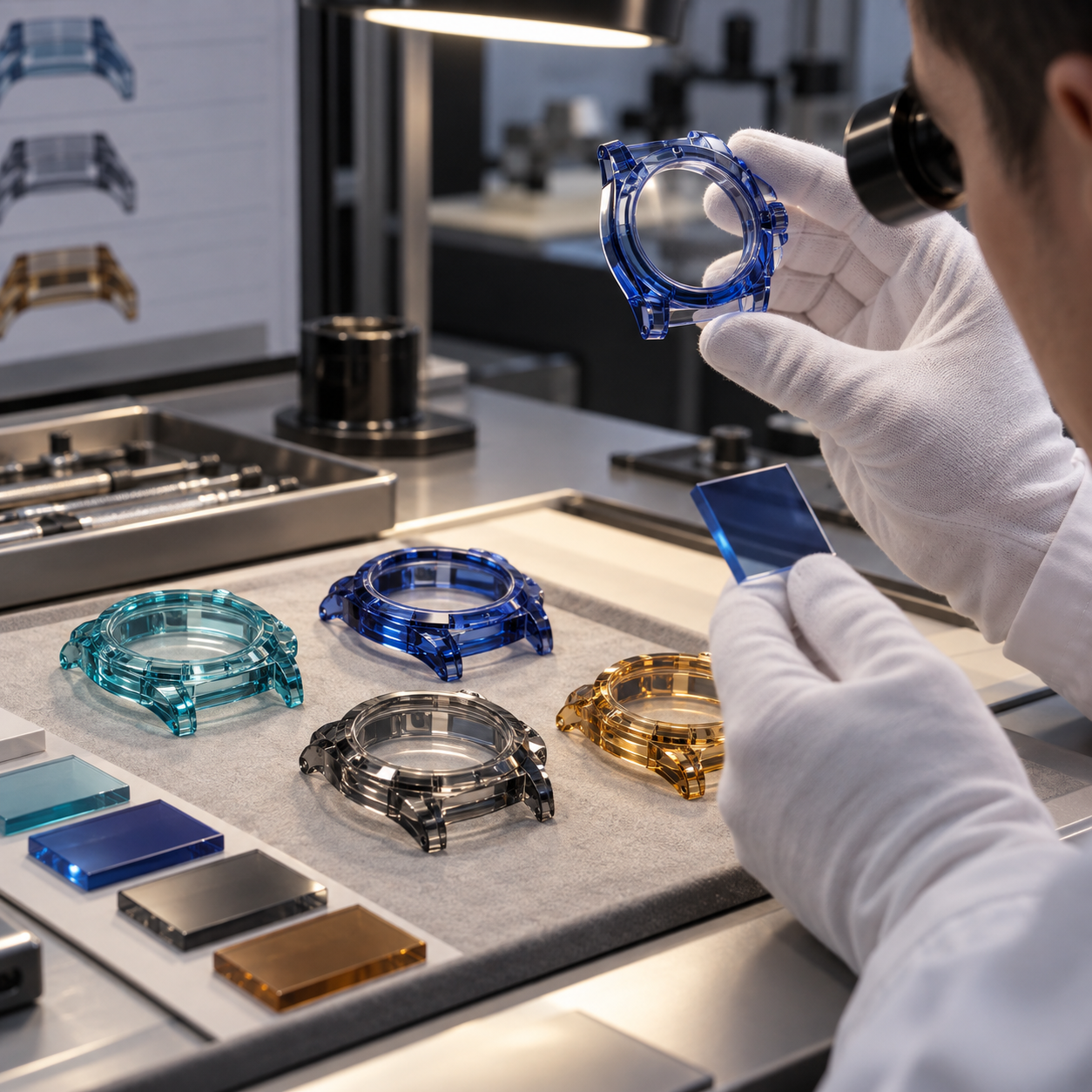
Colored sapphire has become one of the most distinctive materials used in modern luxury watch design.
Clear sapphire emphasizes transparency and movement visibility. Colored sapphire adds another dimension: the case itself becomes part of the visual identity of the watch.
Sea blue, royal blue, pink, red, amber, purple, smoke and other custom color directions can create dramatically different results.
However, specifying the color of a sapphire watch case is much more complicated than selecting a Pantone number.
Two sapphire components made from material described by the same color name may look different after machining and polishing.
Even within a single watch case, a thick lug may appear darker than a thin side wall.
A curved corner may show stronger saturation than a flat surface.
And two production batches may show slightly different color even when both meet the same dimensional drawing.
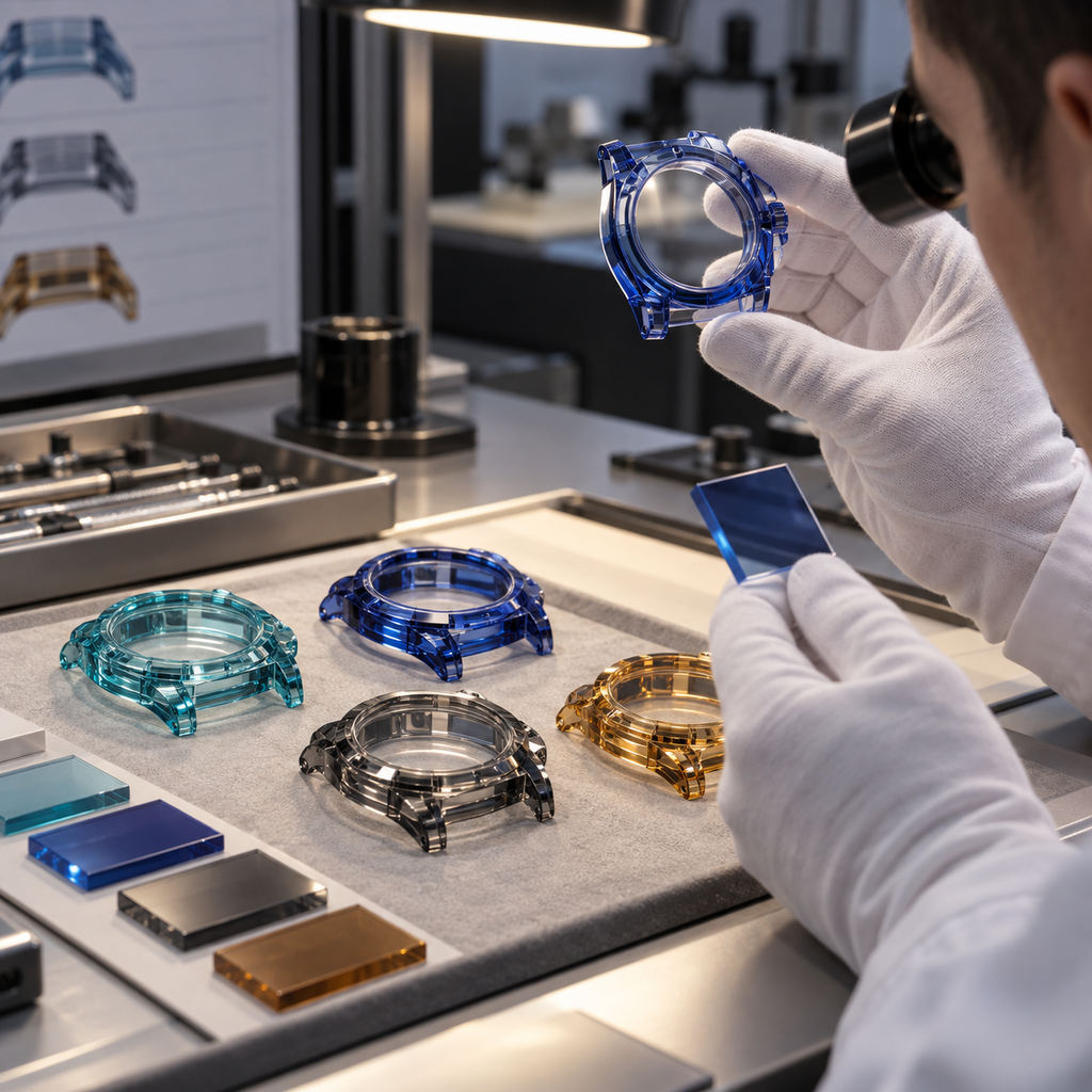
For luxury watch brands, the important question is therefore not simply:
“Can you make blue sapphire?”
The more useful question is:
“How will the color be defined, reproduced and controlled from prototype to batch production?”
Colored Sapphire Is a Transparent Optical Material
Synthetic sapphire is single-crystal aluminum oxide, Al₂O₃.
Pure corundum is essentially colorless. Color appears when specific trace elements and electronic defects modify how the crystal absorbs visible wavelengths.
For example, iron and titanium are closely associated with blue coloration in sapphire, while chromium can produce red or pink coloration. GIA research describes the Fe²⁺–Ti⁴⁺ interaction as an important mechanism responsible for blue sapphire absorption, while chromium is responsible for characteristic red and pink coloration.
This is fundamentally different from a painted or plated metal watch case.
With anodized titanium or PVD-coated metal, color is primarily associated with the surface.
With colored sapphire, the visible effect comes from light traveling through the material itself.
That difference has major consequences for watch-case design.
Why Wall Thickness Changes the Apparent Color
One of the most important factors in colored sapphire is optical path length.
When light enters a transparent colored material, certain wavelengths are absorbed as the light travels through the crystal.
The longer the distance traveled through the material, the more pronounced that absorption can become.
As a practical result:
thin sapphire sections may appear lighter, while thick sapphire sections can appear deeper or darker.
This effect is especially noticeable in strongly colored transparent cases.
Consider a sapphire case with:
- 1.5 mm side walls
- 3 mm bezel sections
- 5 mm lug sections
- thick crown guards
Even if all of these areas were machined from the same sapphire crystal, they may not appear visually identical.
The thicker areas can show greater saturation simply because the light travels through more colored material.
Research into sapphire coloration also demonstrates that sample thickness and chromophore concentration both influence observed color and absorption behavior.
This is why approving a small flat sapphire chip is not enough for a complex watch case.
A 2 mm Color Sample Cannot Always Predict a 6 mm Lug
Imagine that a brand approves a royal-blue sapphire sample measuring:
20 × 20 × 2 mm.
The color may look exactly right.
The final watch case, however, may contain a lug with an optical path of 5 or 6 mm.
The lug can appear substantially darker than the approved sample.
The center case wall may still look close to the reference.
A curved corner may appear darker from one viewing angle and lighter from another.
This does not necessarily mean that different sapphire material was used.
It can be an optical consequence of geometry.
Therefore, when developing a colored sapphire watch case, color should ideally be evaluated at a representative material thickness.
For complex projects, the best reference may be an actual prototype rather than a flat color coupon.
Geometry Changes More Than Thickness
Wall thickness is only one variable.
The shape of the watch case changes how light enters, reflects and exits the sapphire.
Important geometric factors include:
- Curved sidewalls
- Faceted corners
- Integrated lugs
- Crown guards
- Bezel steps
- Internal cavities
- Concave surfaces
- Convex surfaces
- Polished chamfers
A flat wall allows relatively predictable transmission.
A curved or angled structure can redirect light through the sapphire before it reaches the viewer.
Internal reflection can increase the effective optical path.
As a result, apparently simple color differences may actually be caused by geometry.
This is particularly important for tonneau, barrel-shaped, rectangular and highly sculpted sapphire cases.
The existing engineering guidance on SapphireWatchCase also notes that thick areas such as lugs, corners and crown guards can appear darker than thinner case walls because complex sapphire geometry changes perceived saturation.
Why Color Names Are Not Enough
Terms such as:
- Sea Blue
- Royal Blue
- Ice Blue
- Smoke
- Amber
- Pink
are useful for discussing a design direction.
But they are not complete technical specifications.
One company’s “Royal Blue” may be another company’s “Deep Blue.”
Even two digital screens can display the same RGB value differently.
Printed color cards introduce another layer of variation.
A Pantone reference can help communicate an approximate direction, but a printed opaque color cannot perfectly represent the appearance of a transparent colored crystal.
Therefore, a color name should be treated as a starting point rather than a final acceptance standard.
Your site’s existing material specification already takes this approach: Sea Blue and Royal Blue are treated as visual directions, while final acceptance is recommended through a physical reference or approved sample.
Crystal Growth Influences Color Consistency
Colored synthetic sapphire begins at the crystal-growth stage.
The growth process must control not only crystal quality but also the distribution of the elements responsible for color.
Synthetic sapphire can be produced by several growth routes. For watch-case blanks, the appropriate route depends on crystal size, geometry, color requirements, available material and project specifications.
For colored sapphire, the manufacturer must consider whether the relevant dopants remain sufficiently uniform throughout the usable crystal volume.
If the concentration varies significantly along the crystal, different sections cut from the boule may produce different apparent colors.
This becomes especially important for large monobloc cases because a watch case requires a much larger continuous crystal volume than a small gemstone.
Research involving Czochralski-grown synthetic sapphire has shown that controlled trace-element doping can produce highly uniform reference crystals, illustrating why crystal-growth control is fundamental to repeatable coloration.
Color Distribution Inside the Blank Matters
A colored sapphire blank should not be evaluated only from its outside surface.
The final watch case may be machined deep into the blank.
A large amount of material is removed during:
- rough shaping
- cavity machining
- CNC grinding
- hole machining
- fine grinding
- polishing
Therefore, the material remaining in the finished component may originate from a very different region of the original blank.
If the crystal contains significant color zoning, machining can reveal that variation.
For high-end colored watch cases, raw material evaluation should therefore consider:
- overall color direction
- color uniformity
- internal inclusions
- visible zoning
- crystal defects
- blank orientation
- usable volume
Good polishing cannot compensate for unsuitable raw crystal.
Why Two Batches Can Look Different
Batch-to-batch variation can come from several sources.
Crystal Growth Batch
Two boules may contain slightly different concentrations or distributions of color-causing elements.
Blank Position
Even material from one boule may not be visually identical throughout its entire volume.
Wall Thickness
Small machining differences can change optical path length in visually sensitive areas.
Surface Finish
A highly polished surface transmits and reflects light differently from a frosted surface.
Geometry
Small radius or profile changes can alter internal reflections.
Lighting
The same component can look different under warm showroom lighting and cool daylight.
Background
A transparent blue case placed over a black movement may appear deeper than the same case viewed against white paper.
Viewing Angle
Colored sapphire may show changes in perceived saturation as the optical path changes with angle.
For this reason, color consistency is a combination of material control and finished-part control.
Lighting Conditions Must Be Defined
A colored sapphire case should not be approved under arbitrary lighting.
A blue case may look bright and slightly cyan under daylight-type illumination but darker under warm indoor lighting.
A smoke-colored case may look neutral against a white background but much darker when assembled around a black movement.
Therefore, visual inspection should use agreed conditions.
A practical color-approval procedure can specify:
- Light source
- Approximate color temperature
- Viewing background
- Viewing distance
- Part orientation
- Comparison sample
- Acceptable visual variation
For critical projects, the approved reference should remain available throughout production.
Use a Physical Master Sample
For luxury colored sapphire projects, one of the most effective methods is to create a master color sample.
After the first successful prototype is approved, that component becomes the physical visual reference for future production.
The master sample should ideally represent:
- actual sapphire material
- actual wall thickness
- actual geometry
- actual polish
- actual production process
This is much more useful than comparing a finished case against a computer image.
Future batches can then be evaluated against the approved physical sample.
A Flat Coupon Still Has Value
Although a flat color coupon cannot perfectly predict a three-dimensional case, it is still useful during early development.
Flat samples can help compare:
- lighter versus darker blue
- different dopant levels
- clear versus smoke
- pink saturation
- amber direction
- transmission level
Once a general color direction is selected, the next stage should move toward representative geometry.
A useful development sequence might be:
digital reference
→ physical material coupon
→ representative machined sample
→ full watch-case prototype
→ approved master sample
This gradually reduces uncertainty.
Sea Blue and Royal Blue Need Different Acceptance Logic
Consider two common project directions.
Sea Blue
A bright blue direction generally depends strongly on transparency and illumination.
If the material becomes too saturated, the intended light blue appearance can be lost in thick sections.
Therefore, Sea Blue projects may require particular attention to:
- wall thickness
- optical clarity
- thick lug areas
- internal reflection
- dark movement backgrounds
Royal Blue
A deeper blue direction can tolerate more saturation but creates another challenge.
Very thick areas may become visually too dark or lose transparency.
For a skeleton watch, excessive saturation can reduce movement visibility.
The objective is therefore not simply to create the darkest possible blue.
The material should support the intended balance between:
color + transparency + movement visibility.
Polish Quality Influences Perceived Color
Color consistency is not only a material problem.
Surface quality can significantly change the visual result.
If one region is perfectly polished and another retains microscopic grinding damage, haze or unevenness, light transmission changes.
The less transparent region may appear:
- darker
- milkier
- less saturated
- less brilliant
This can easily be mistaken for a material color difference.
Sapphire polishing therefore influences both optical clarity and perceived color consistency. Your site’s existing polishing guide similarly notes that colored sapphire can make haze and polishing differences more noticeable.
Polished and Frosted Areas Will Not Match Visually
Some watch designs intentionally combine optical polish with frosted sapphire.
This can create an attractive contrast.
However, the two surfaces should not be expected to show exactly the same apparent color.
A polished surface allows stronger transmission and specular reflections.
A frosted surface scatters light.
The frosted area may therefore look:
- lighter
- softer
- more diffuse
- less transparent
even though the underlying sapphire material is identical.
This difference should be treated as part of the design rather than a manufacturing defect.
Multi-Part Cases Require Set Matching
Color matching becomes more difficult when a watch uses several sapphire components.
For example:
- sapphire bezel
- sapphire middle case
- sapphire caseback
- sapphire crown component
- sapphire pushers
- sapphire bracelet links
If these parts are produced from different blanks or different growth batches, slight visual differences may become noticeable after assembly.
For a premium project, it can therefore be useful to specify that visually adjacent components must be matched as a set.
Possible strategies include:
- producing major components from the same material batch
- grouping blanks by visual color
- comparing finished parts before assembly
- maintaining approved sets during final inspection
The appropriate method depends on quantity, blank availability and the level of visual consistency required.
Wall Thickness Should Be Included in the Color Specification
When requesting colored sapphire, the RFQ should not say only:
Color: Royal Blue
A better request includes information such as:
Color direction: Royal Blue
Representative wall thickness: 3.5 mm
Maximum local thickness: 6 mm
Finish: High polish
Visual reference: Approved physical sample
Matching requirement: Case middle and bezel to be matched as one set
This gives the sapphire manufacturer much more useful information.
Your existing Materials & Colors page similarly recommends specifying representative wall thickness and whether multiple parts must match as a set.
Instrument Measurement Can Support Visual Inspection
For some projects, color measurement equipment can provide additional production data.
Possible tools include:
- spectrophotometry
- transmission measurements
- controlled photographic comparison
- color-coordinate measurements
However, numerical color data should be interpreted carefully.
A transparent three-dimensional sapphire watch case is not equivalent to a flat opaque color sample.
Geometry, thickness and viewing direction can influence the measurement.
Therefore, numerical data is usually most useful when combined with:
a defined measurement method + representative measurement position + approved visual sample.
The instrument improves traceability.
It does not eliminate the need for physical approval.
Batch Consistency Should Be Defined Before Production
The phrase “same color” is subjective unless an acceptance method is agreed.
Before batch production, the supplier and customer should define:
- What is the master reference?
- Which surfaces are color-critical?
- Under what lighting is the comparison made?
- Are parts compared individually or as assembled sets?
- Is slight variation between hidden surfaces acceptable?
- Are thick and thin regions expected to appear identical?
- What level of batch variation is acceptable?
Resolving these questions before production prevents disagreement after finished cases are completed.
Prototype Approval Should Include the Final Geometry
The most reliable color approval is not a raw sapphire blank.
It is a finished or near-finished prototype representing the production geometry.
The prototype allows the customer to evaluate:
- saturation
- transparency
- movement visibility
- thick-wall appearance
- lug appearance
- corner reflections
- finish
- assembled appearance
If the customer approves only a flat color sample and later rejects the final case because the lugs appear darker, the problem may not be manufacturing inconsistency.
It may be an incomplete approval process.
Color Matching Becomes More Difficult With Complex Cases
Simple round cases with relatively uniform wall thickness are easier to control visually.
Complex cases introduce more optical variation.
Examples include:
- tonneau cases
- integrated lugs
- large crown guards
- stepped sidewalls
- asymmetric cases
- skeletonized sapphire structures
- multi-level bezels
A thick integrated lug may naturally show more saturation than a thin transparent sidewall.
Trying to force every region to appear visually identical may not be physically realistic.
Instead, designers should identify which differences are expected from geometry and which represent unacceptable material variation.
Matching Colored Sapphire to Other Materials
Many modern watches combine sapphire with:
- titanium
- ceramic
- carbon composite
- rubber
- colored metal
- coated movement bridges
The surrounding materials influence how the sapphire is perceived.
A Sea Blue case around a bright silver movement may appear very different from the same case around a black DLC-coated movement.
Similarly, a Royal Blue sapphire case next to polished titanium creates a different visual impression from the same sapphire beside matte black ceramic.
Color development should therefore consider the complete watch architecture rather than the isolated sapphire component.
What Should Brands Send With an RFQ?
For a custom colored sapphire watch case, useful RFQ information includes:
Geometry
- 2D drawing
- STEP file
- Overall case dimensions
- Minimum wall thickness
- Maximum local wall thickness
- Critical visible sections
Color
- Target color direction
- Physical reference if available
- Existing sapphire sample if available
- Photos for initial discussion
- Required transparency level
Surface
- High polish
- Frosted areas
- Mixed finish
- Polished chamfers
Matching
- Single case only
- Bezel and case matching
- Case and caseback matching
- Full-set matching
- Bracelet-link matching
Production
- Prototype quantity
- Target production quantity
- Required inspection documentation
- Batch consistency requirement
The more information provided at the beginning, the easier it is to determine whether the requested visual result is technically realistic.
A Practical Color Approval Workflow
A controlled colored sapphire watch-case project can follow this sequence:
- Define target color direction
- Review watch geometry and wall thickness
- Select candidate sapphire material
- Produce physical color samples if necessary
- Select the closest color direction
- Manufacture representative prototype geometry
- Complete final polishing
- Evaluate under controlled lighting
- Assemble with representative watch components when possible
- Approve a physical master sample
- Establish batch acceptance criteria
- Start production
- Compare finished production sets against the approved reference
This process is more reliable than trying to specify a transparent sapphire case using only a digital color value.
The Goal Is Repeatable Appearance, Not Just a Color Name
Colored sapphire is attractive precisely because light interacts with the entire three-dimensional crystal structure.
That optical depth gives a sapphire watch case its distinctive appearance.
But it also means color cannot be controlled in the same way as ordinary paint, anodizing or opaque ceramic.
The final appearance depends on a combination of:
**crystal chemistry
- crystal growth
- material batch
- wall thickness
- optical path length
- case geometry
- surface polish
- lighting
- background
- viewing angle**
For this reason, successful color matching requires cooperation between the watch designer, sapphire manufacturer and final assembly team.
The most effective approach is not to ask whether every millimeter of the case can display exactly the same blue.
Instead, the project should define a controlled visual target, understand how the geometry affects that target and establish a repeatable reference for future production.
For luxury watch brands developing Sea Blue, Royal Blue, pink, red, amber, smoke or other custom sapphire cases, early color validation can significantly reduce the risk of prototype rejection and batch-to-batch disputes.
Planning a custom colored sapphire watch case?
Send your 2D drawing, STEP file, target color direction, representative wall thickness and reference sample or image. The material, geometry, optical appearance and batch-matching requirements can then be reviewed together before prototype production.