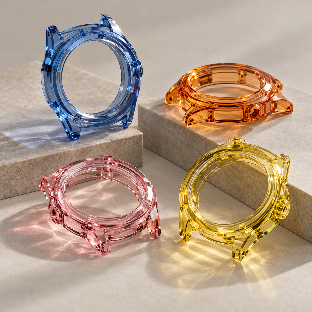
Colored sapphire has become one of the most distinctive materials available to modern luxury watch designers.
Blue, pink, yellow, orange, purple and other transparent sapphire colors can transform a mechanical watch into an immediately recognizable product.
However, colored sapphire also introduces a manufacturing challenge that is often underestimated during the early design stage:
color matching.
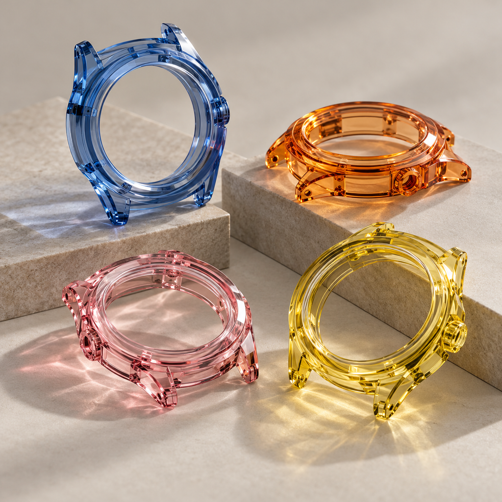
A customer may provide a rendering showing one exact shade of blue or orange and expect every finished sapphire case to match that color perfectly.
In real production, the situation is more complicated.
The perceived color of a sapphire watch case depends not only on the raw crystal but also on thickness, geometry, polishing, lighting and the components surrounding the sapphire.
Understanding these variables is important for watch brands planning prototypes or small-batch colored sapphire production.
Colored Sapphire Is Not Like Painted Metal
A stainless-steel watch case can be coated to create a relatively uniform surface color.
Sapphire works differently.
The color exists within the transparent crystal.
Light enters the material, travels through it, reflects from internal and external surfaces and eventually reaches the viewer.
This creates the optical depth that makes colored sapphire visually attractive.
It also means that the same sapphire material can appear different depending on how much material the light passes through.
A 1.5 mm section and a 6 mm section of the same sapphire may not appear to have the same color intensity.
This is normal optical behavior rather than necessarily a material defect.
Thickness Has a Major Influence on Color
Consider a transparent blue sapphire watch case.
A thin bezel area may appear:
- light blue
- highly transparent
- almost colorless at certain angles
A thick side wall may appear:
- deeper blue
- darker
- more saturated
A thick corner or lug may appear darker still.
The finished watch therefore contains a natural gradient even when every part is manufactured from the same sapphire blank.
This effect becomes particularly noticeable in cases with:
- heavy lugs
- thick crown guards
- deeply curved side walls
- optical domes
- large polished chamfers
- significant differences in wall thickness
Designers should account for this behavior when evaluating renderings.
Geometry Changes How Light Travels
Thickness is not the only variable.
The direction and curvature of a surface can change the optical path.
Convex surfaces can concentrate or redirect light.
Concave surfaces may produce darker zones.
Angled facets can reflect surrounding colors.
Internal cavities can create multiple reflections.
As a result, two areas with approximately the same thickness can still appear different.
This is one reason why colored sapphire cases often look more dynamic in real life than in photographs.
The case changes appearance as the wrist moves.
For a luxury watch, this can be an advantage.
But it needs to be intentionally incorporated into the design.
Polishing Influences Perceived Color
A machined sapphire surface before final polishing is not completely transparent.
Microscopic surface roughness scatters light and produces a cloudy appearance.
As polishing improves, transparency increases.
This changes the apparent color as well.
A well-polished surface often appears:
- clearer
- deeper
- more luminous
- more reflective
Poorly polished areas can appear hazy or lighter because light is scattered before travelling through the crystal.
Therefore, color inspection should normally take place after representative polishing rather than only on a rough-machined sample.
Edge Chamfers Create Bright Highlights
Transparent colored sapphire responds especially strongly to polished edges.
A narrow chamfer can create a bright line around the case.
Depending on the viewing angle, it may appear significantly lighter than the surrounding material.
Luxury watch designers often use this deliberately.
Well-controlled polished chamfers can visually define:
- bezel outlines
- lug edges
- case flanks
- crown openings
- transitions between curved surfaces
However, inconsistent chamfer width or polishing can create visible differences between production pieces.
Therefore, edge geometry should be properly defined on the drawing.
Raw Crystal Selection Matters
For colored sapphire projects, the raw material should be considered as part of the engineering specification.
Important factors may include:
- color family
- target shade
- transparency
- internal inclusions
- crystal size
- usable material area
- color distribution
- required finished dimensions
When large sapphire blanks are required, sourcing becomes more challenging.
A small colored sapphire crown or decorative insert requires much less usable crystal than a large monobloc watch case.
This is one reason why the feasibility of a particular color should be evaluated together with the required case dimensions.
One Prototype Is Not Always Enough for Color Approval
When color is one of the main design characteristics, a single prototype may not fully define the acceptable production range.
The first prototype can confirm:
- general color direction
- transparency
- optical depth
- movement visibility
- case geometry
However, a production batch may contain slight visual differences.
For critical luxury projects, it can be helpful to define an approved color range rather than expecting an undefined concept of “exactly the same.”
This can be done using:
- approved physical samples
- controlled photographs
- reference material pieces
- agreed visual inspection conditions
Physical reference samples are often more useful than computer screen colors.
Why Pantone Alone Is Not Enough
Customers sometimes specify a Pantone color for a sapphire case.
Pantone can be useful as a communication reference, but it cannot completely define the appearance of transparent sapphire.
Pantone systems are primarily designed around surface colors.
Transparent sapphire has:
- optical depth
- varying transmission
- internal reflections
- thickness-dependent saturation
Therefore, a sapphire part cannot always be expected to match an opaque Pantone sample under every lighting condition.
A better approach is to use Pantone as an initial target and then approve a physical sapphire sample.
Lighting Conditions Can Change the Result
Colored sapphire can look noticeably different under different light sources.
For example, the same case may appear different under:
- daylight
- warm indoor lighting
- cool LED lighting
- photographic studio lighting
- direct sunlight
This makes controlled inspection conditions valuable.
When customers and manufacturers evaluate color in different environments, unnecessary disagreements can occur.
For important projects, the approval process should define how the color will be evaluated.
Surrounding Components Also Affect Color
A transparent sapphire case does not exist visually in isolation.
The movement, dial, gasket, screws and caseback can all be visible through the sapphire.
A dark movement may make a blue sapphire case appear more saturated.
A silver movement may create a brighter appearance.
Gold-colored components can create warm reflections through orange or yellow sapphire.
Black gaskets may become visible through a transparent case.
This is why the complete watch should be considered during optical development.
The sapphire case and movement architecture need to work together.
Clear Gaskets Are Not Always Invisible
Watch designers sometimes request transparent or clear seals because they do not want gaskets to interrupt the visual appearance of the case.
However, even transparent polymers have their own refractive properties.
Depending on geometry, a gasket can still create visible lines or optical changes.
The groove design, gasket compression and surrounding polished surfaces all affect the final result.
Therefore, gasket visibility should be checked during prototype assembly.
Batch Consistency Requires Planning
For a one-piece prototype, the manufacturer may select an especially suitable area of crystal.
For larger quantities, the challenge changes.
A production project may require enough matching material for:
- 10 cases
- 20 cases
- 50 cases
- 100 cases
The larger the batch, the more important material planning becomes.
If color consistency is critical, it may be beneficial to reserve sufficient raw material for the complete batch rather than purchasing material independently for each later order.
This is especially relevant for unusual colors.
Blood Orange and Other Custom Colors
Orange-toned sapphire illustrates the complexity of colored sapphire particularly well.
Depending on material composition and thickness, the same general material family may appear:
- pale champagne-orange
- amber
- vivid orange
- reddish orange
- deep blood orange
For a watch brand, these differences can completely change the character of the finished product.
The design team should therefore define whether it wants:
- maximum transparency
- maximum color saturation
- a lighter modern appearance
- a deeper jewellery-like appearance
The correct choice depends on the movement and complete watch design.
How to Improve Color Consistency
Several practical steps can improve a colored sapphire watch-case project.
1. Approve Material Before Full Machining
Whenever possible, evaluate representative raw sapphire or polished samples.
2. Provide a Physical Color Reference
A physical sample is often more reliable than a screenshot.
3. Define Critical Areas
Decide which sections of the case are most important for color evaluation.
4. Maintain Similar Wall Thickness Where Practical
Large thickness variations create stronger changes in color intensity.
5. Use Controlled Inspection Lighting
Evaluate different samples under comparable conditions.
6. Reserve Material for Production
For unusual colors, consider securing material for the planned production quantity.
7. Approve a Range Rather Than One Digital Value
Real transparent materials naturally show optical variation.
What Information Should Be Sent to the Manufacturer?
For a colored sapphire watch-case quotation, useful information includes:
- required color
- reference image or physical sample
- case dimensions
- 2D drawing
- STEP file
- maximum wall thickness
- expected optical transparency
- surface polishing requirements
- required quantity
- acceptable color variation
The manufacturer can then review both material availability and machining feasibility.
Conclusion
Color is one of the biggest advantages of sapphire watch-case design, but it also introduces a new set of engineering and quality-control considerations.
A colored sapphire case should not be evaluated in the same way as painted or coated metal.
Its appearance is created by the interaction of:
crystal color + thickness + geometry + polishing + lighting + surrounding watch components.
For watch brands developing custom blue, pink, yellow, orange or other colored sapphire cases, early color approval and material planning can significantly reduce risk during production.
The objective should not be to eliminate every natural optical variation.
Instead, the goal is to control the material well enough that those variations become part of a consistent and intentional luxury watch design.